


Blog
Typography in Album Art: The Power of Words

Oct


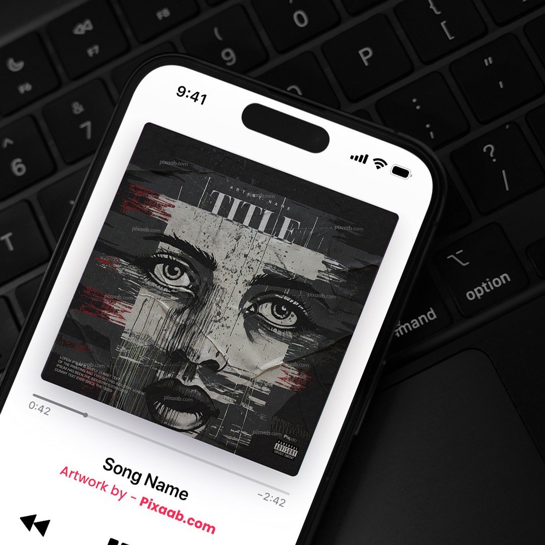


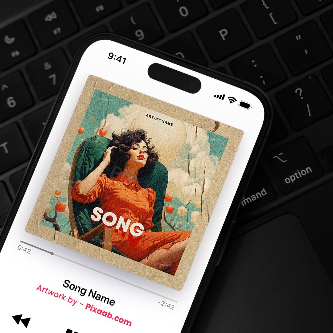
When it comes to album covers, images often steal the spotlight, but the role of typography should not be underestimated. Typography plays a crucial part in conveying the mood, style, and message of an album. In this blog post, we will explore the world of typography in album art and provide valuable tips on choosing fonts and arranging text effectively.
The Significance of Typography in Album Art:
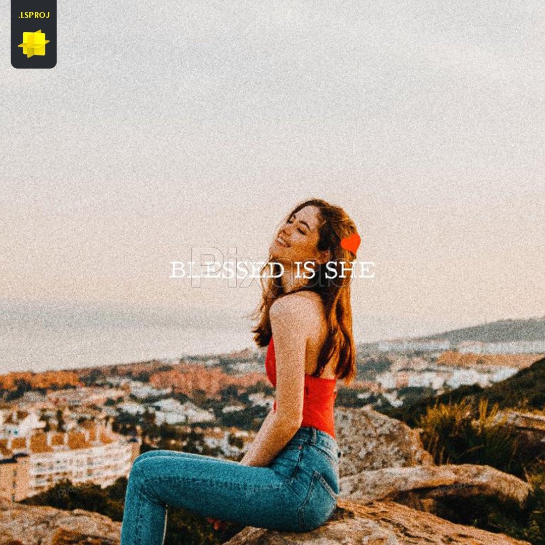
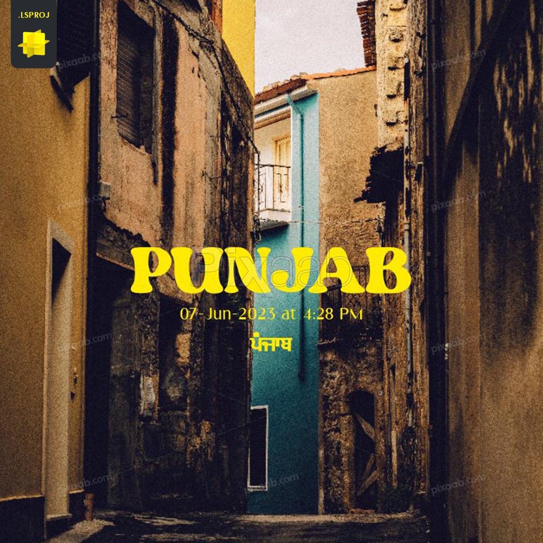
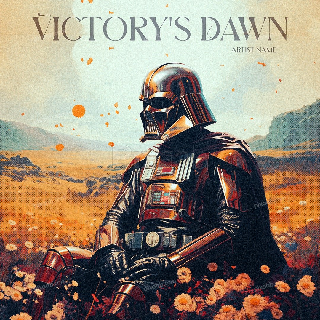
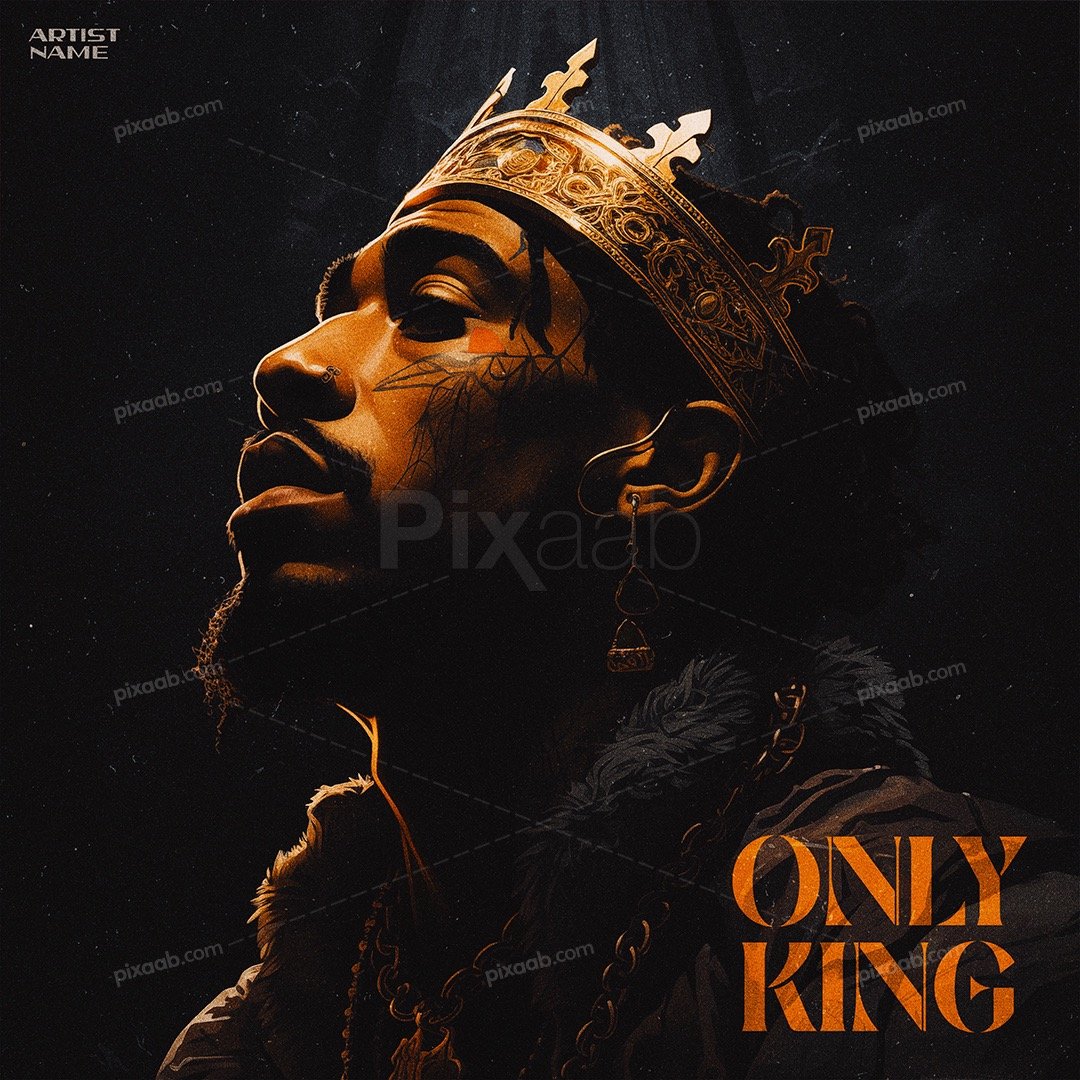
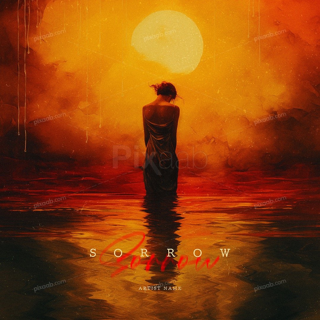
- Setting the Tone: Typography sets the initial tone for the album. Whether it’s bold, elegant, playful, or mysterious, the choice of fonts immediately communicates what listeners can expect from the music.
- Conveying the Message: Album titles, track listings, and artist names are vital components of album covers. Typography ensures that this essential information is presented clearly and in a visually appealing manner.
- Enhancing the Aesthetic: Well-crafted typography can transform a plain album cover into a work of art. The right font choice and text arrangement can make the design more engaging and memorable.
Choosing the Right Fonts:
- Match the Genre: Consider the genre of music when selecting fonts. For example, classical music may benefit from elegant and timeless serif fonts, while punk rock might call for edgy and grunge-inspired typefaces.
- Maintain Readability: While artistic fonts can be captivating, readability should never be compromised. Ensure that the text is easy to read, especially when it comes to the album title and artist name.
- Pair Fonts Thoughtfully: Mixing fonts can add depth and character to your design. Pair a bold, attention-grabbing font with a more subtle one for a harmonious contrast.
Arranging Text Effectively:
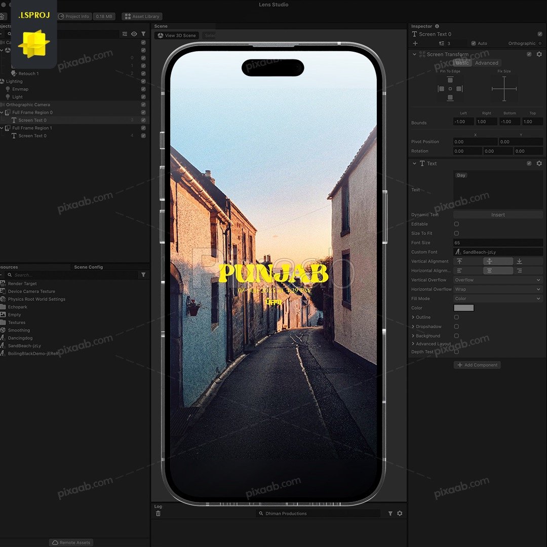
- Hierarchy is Key: Establish a clear hierarchy of text elements. The album title should generally be the most prominent, followed by the artist’s name and track listings. Use font size, weight, and color to differentiate these elements.
- Balance and Alignment: Maintain balance in your design by aligning text elements strategically. Centered alignment is classic and formal, while left-aligned text may convey a more modern and casual feel.
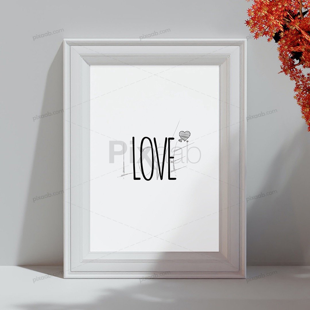
- Negative Space: Embrace negative space to give your typography room to breathe. Avoid cluttering the cover with excessive text or graphics, as it can overwhelm the viewer.
Testing and Feedback:
- Seek Opinions: Before finalizing your typography, gather feedback from others. Different perspectives can help identify areas for improvement.
- Test Across Devices: Ensure that your typography remains legible and visually appealing on various devices and screen sizes, as digital distribution is prevalent.
Typography is a powerful tool in album art design, capable of conveying emotions, genre aesthetics, and essential information. By carefully choosing fonts that align with the music’s style and arranging text elements effectively, you can create album covers that not only grab attention but also enhance the overall listening experience. Whether your music is a symphony of classical notes or a rebellious rock anthem, the right typography can be the key to making your album art truly unforgettable.