Blog
Mastering Typography: Your Gateway to Stunning Designs
Introduction
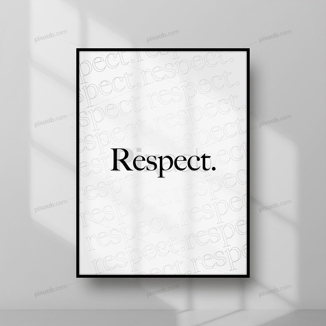
Typography, the art of arranging type to enhance communication, is the backbone of design across both traditional and digital platforms. Delving into its basics can revolutionize your design prowess and amplify the impact of your messages. This beginner’s guide unlocks the fundamentals of typography, offering examples and practical applications to ignite your creativity.
Deciphering Typography
Typography isn’t just about picking fonts – it’s the strategic interplay of typefaces, sizes, spacing, and alignment to convey messages effectively. By mastering these elements, you elevate the readability and visual appeal of your designs, ensuring they captivate your audience.
The Typeface Universe
Typefaces inhabit diverse worlds, from the elegant serifs to the sleek sans-serifs, the playful scripts, and the attention-grabbing display fonts. Each category serves a distinct purpose, whether it’s adding sophistication, clarity, personality, or sheer impact to your designs.
Typography in Action
- Serif: Times New Roman – A stalwart in print media, this serif font exudes tradition and authority, making it perfect for scholarly texts and formal documents.
- Sans-Serif: Arial – With its clean lines and modern aesthetic, Arial dominates digital interfaces, signage, and presentations, ensuring clarity and versatility.
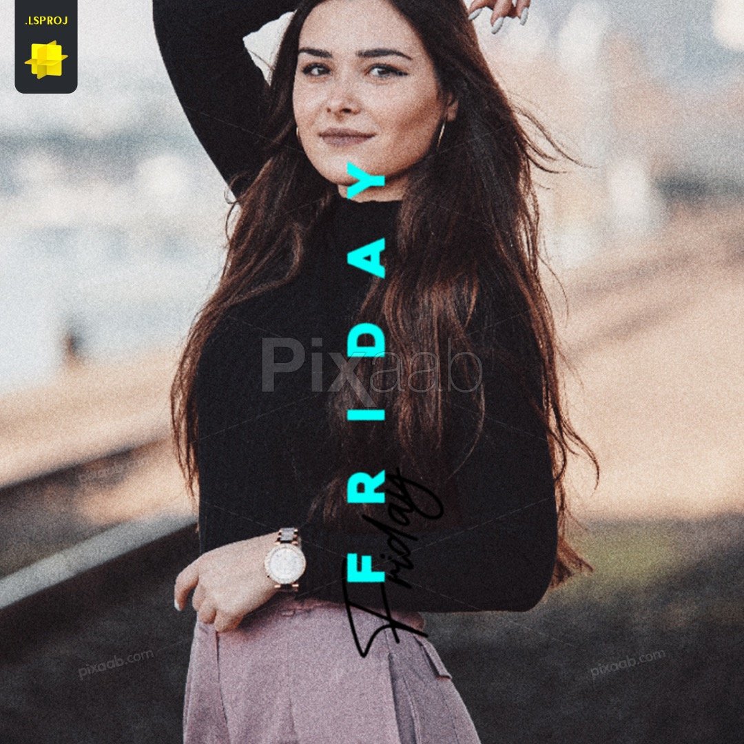
- Script: Pacifico – Infusing a touch of whimsy and elegance, Pacifico lends warmth to branding, invitations, and creative endeavors, adding a personal flair.
- Display: Impact – Bold and attention-grabbing, Impact commands attention in headlines, posters, and advertisements, leaving a lasting impression.
Typography’s Role in Design
Typography isn’t just a finishing touch – it’s the cornerstone of graphic design, web design, and branding. It shapes layouts, enhances user experience, and establishes brand identities, making it indispensable in the design realm.
Golden Rules of Typography
- Hierarchy: Establish a clear order of importance to guide your audience’s attention, employing variations in size, weight, and style strategically.
- Alignment: Align elements with precision, be it to a grid or baseline, ensuring coherence and readability across your design.
- Contrast: Harness the power of contrast to create visual interest and enhance readability, experimenting with font attributes to craft dynamic compositions.
Practical Typography Tips
- Font Selection: Choose fonts wisely to complement your content and audience, considering factors like readability, tone, and context.
- Consistency: Maintain uniformity in typography to establish a polished and professional look, sticking to a cohesive set of typefaces and formatting rules.
- Whitespace: Embrace whitespace as a design element, using it strategically to enhance readability and visual balance, preventing clutter and ensuring clarity.
Typography isn’t just about letters on a page – it’s a gateway to captivating designs and effective communication. By grasping its principles and experimenting with its nuances, you unlock a world of creative possibilities, transforming your designs from ordinary to extraordinary.


