


Blog
Album Art Color Psychology: Creating Emotional Impact Through Color Choices

Oct


In the world of album art, the power of visuals cannot be underestimated. Album covers are not just about aesthetic appeal; they are a gateway to the emotions and stories that lie within the music. One crucial element that plays a pivotal role in conveying these emotions is color.
Color psychology, the study of how colors affect human behavior and emotions, is a vital aspect of album cover design. The right color choices can set the mood, evoke specific feelings, and even define the genre of music the album represents. In this blog post, we will dive into the fascinating world of album art color psychology and explore how artists can harness the emotional impact of colors to create captivating album covers.
The Language of Colors in Album Art
Colors have a unique ability to communicate without words. They tap into our subconscious and trigger emotional responses. In album art, colors serve as a visual language that speaks directly to the viewer and potential listener. Here are some common emotional associations with colors in the context of album covers:
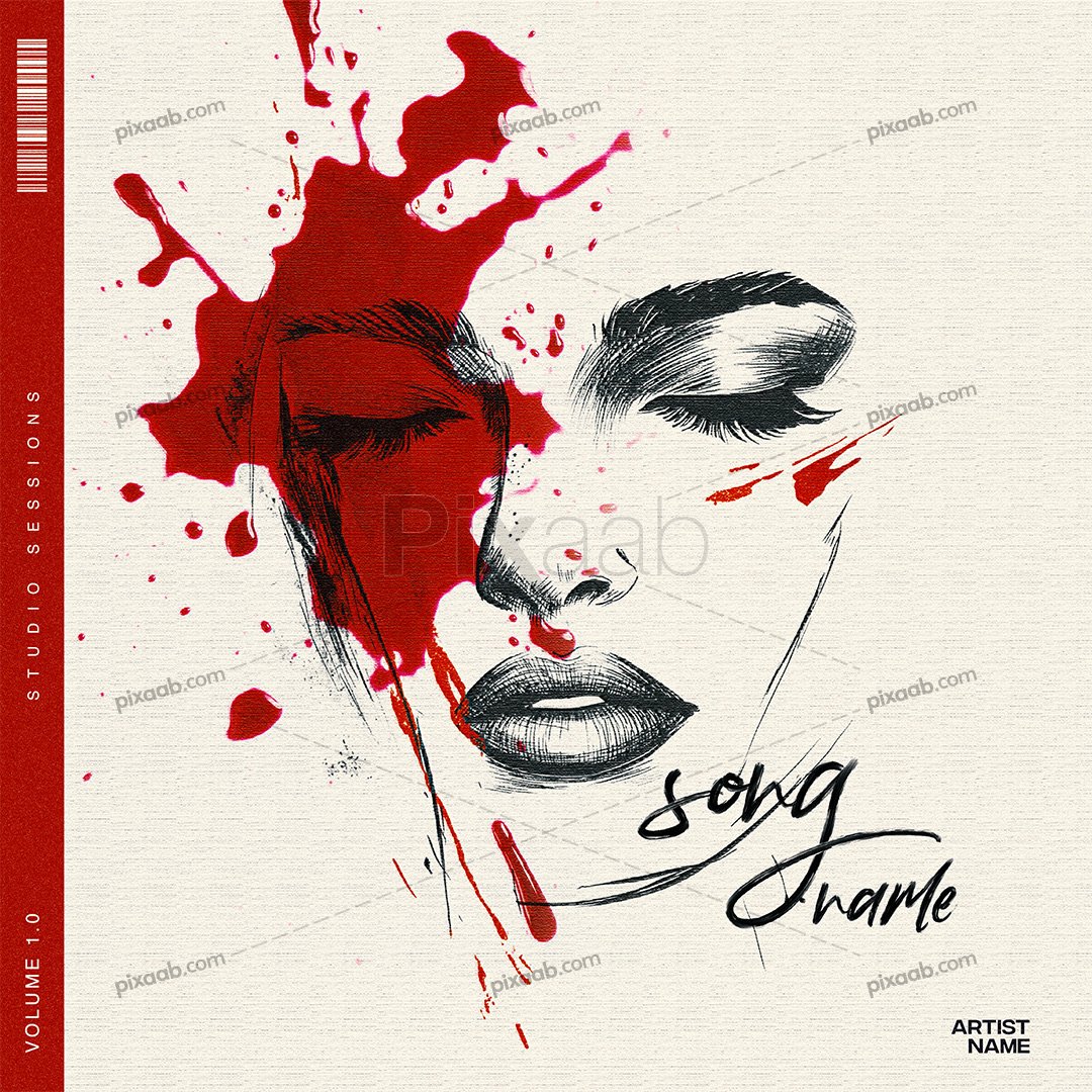
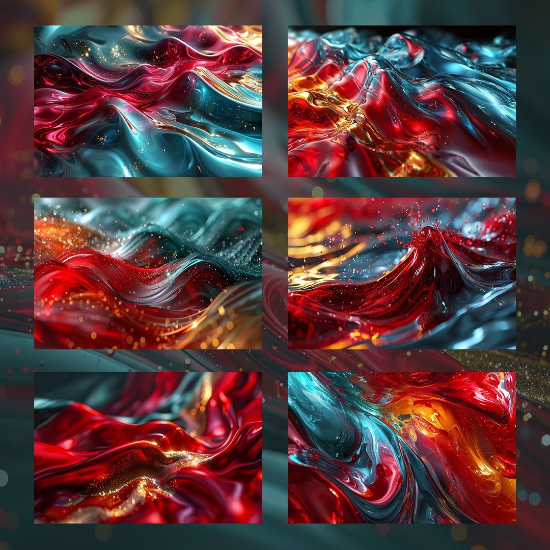
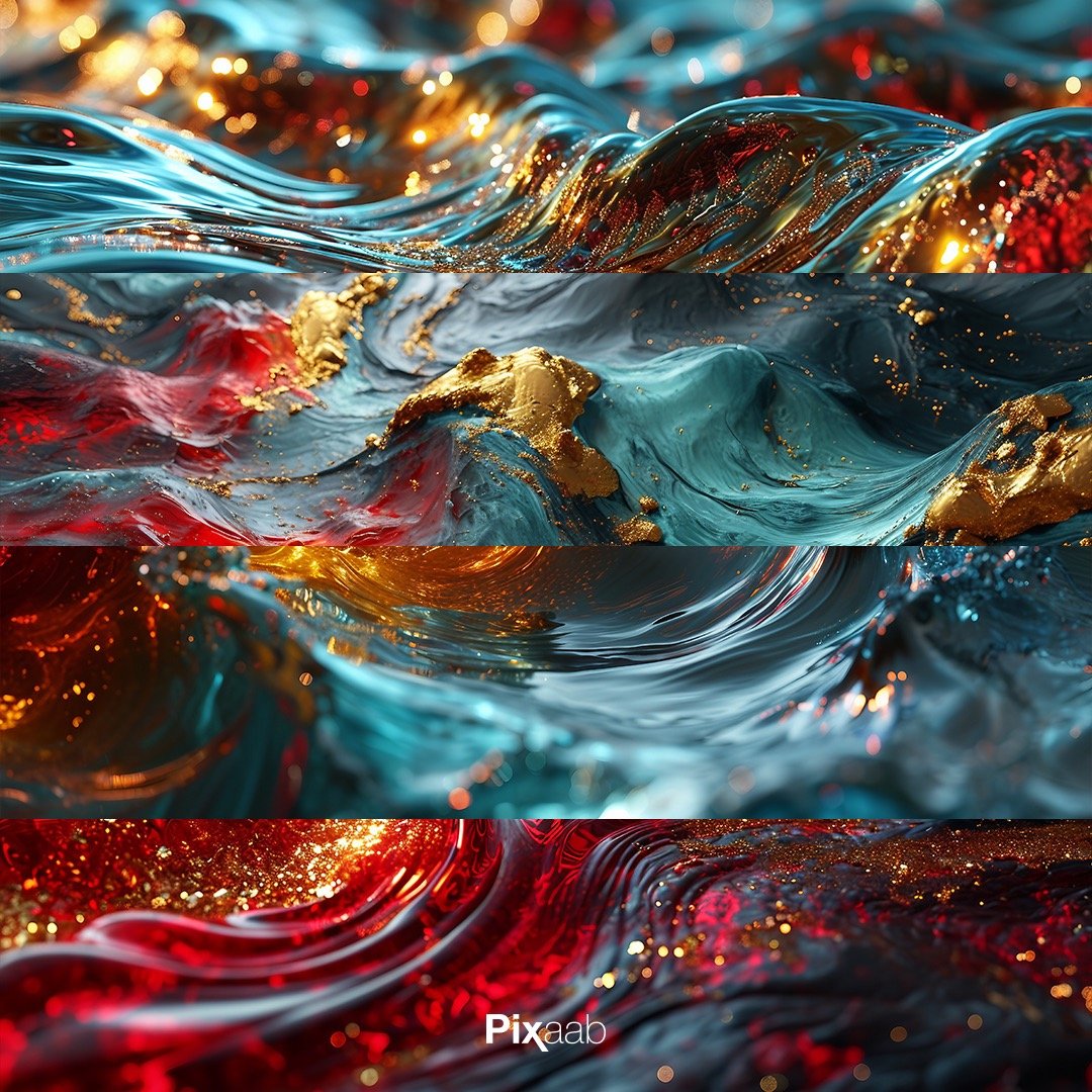
- Red: Passion, love, and intensity. Red can convey powerful emotions and is often associated with romance or strong emotional themes in music.
- Blue: Calm, serenity, and depth. Blue hues are ideal for conveying a sense of tranquility or introspection in album art.
- Yellow: Happiness, energy, and positivity. Yellow is perfect for albums with upbeat and cheerful music.
- Black: Elegance, mystery, and sophistication. Black adds a touch of drama and intrigue to album covers, often seen in genres like rock and metal.
- Green: Nature, growth, and freshness. Green can represent themes of renewal or environmental consciousness in music.
- Purple: Creativity, luxury, and spirituality. Purple is often chosen for albums with a mystical or artistic vibe.
Setting the Mood with Color
The choice of colors in album art is not random; it’s a deliberate decision made by artists and designers to align the visual identity of the album with its musical content. Consider the following scenarios:
- Matching Genre: Different music genres have distinct color palettes associated with them. For example, warm, earthy tones might be preferred for folk or acoustic music, while vibrant, bold colors could be a better fit for pop or electronic music.
- Conveying Emotions: If the album is an emotional rollercoaster, the colors chosen should reflect the various emotional states explored in the music. Gradations of color can represent transitions between different moods.
- Creating Contrast: Sometimes, using contrasting colors can make an album cover stand out. This contrast can be used to highlight specific elements, such as the artist’s name or album title.
- Storytelling: Album art is a storytelling device. Colors can be used to narrate a story or symbolize key themes in the music. For example, a transition from dark to light colors can symbolize a journey from despair to hope.
Tips for Effective Use of Color in Album Art
Now that we understand the significance of color in album art, here are some practical tips for artists and designers:
- Know Your Audience: Understand your target audience’s preferences and emotional triggers. The colors that resonate with one group may not have the same impact on another.
- Consistency: Maintain a consistent color scheme across all visual elements associated with your music, including promotional materials, social media, and merchandise. This reinforces your brand identity.
- Experiment: Don’t be afraid to experiment with color combinations. Sometimes, unexpected pairings can result in striking and memorable album covers.
- Test the Waters: Before finalizing your album art, consider creating mockups and gathering feedback from a diverse group of people. This can help you gauge the emotional response your cover evokes.
- Consider Cultural Context: Keep in mind that colors can have different cultural associations. What may symbolize mourning in one culture could represent celebration in another.
In conclusion, album art color psychology is a powerful tool for musicians and designers alike. By understanding the emotional impact of colors and using them strategically, you can create album covers that not only capture the essence of your music but also resonate deeply with your audience. So, the next time you embark on the journey of designing album art, remember the language of colors and let them speak volumes about your music.